
It was 8:00 am on a sunny morning in Hawaii in January. People were hustling to get to their typical morning responsibilities. Cars were on the highway commuting to work, school, and other destinations when all of a sudden chaos breaks out. People start to panic, kids have been thrust down sewers for safety, everyone takes cover, and the once darting cars are now abandoned. What happened? What changed?
On the morning of January 13, 2018, an accidental emergency ballistic missile alert was broadcast to all resident’s cell phones and the highway road signs,
“BALLISTIC MISSILE THREAT INBOUND TO HAWAII. SEEK SHELTER IMMEDIATELY. THIS IS NOT A DRILL.”
To better understand how an accident like this could happen, let’s travel back a few years. In the late 1970s, the personal computer industry was just starting to emerge. A field of study called Human-Computer Interaction was getting off the ground. It’s a mix of cognitive psychology, linguistics, and artificial intelligence as applied to technology. And most important how it was applied to people interacting and using computers. And as such, how do we make technologies previously used only by professionals more usable and understandable to a common population?
Fast forward 20 years into the early 1990s, the term “user experience design” is coined. And though it applies much more broadly than just computers and our human experience with digital technologies, it is directly correlated. Many hear that term and it immediately conjures visual design and how “pretty” a thing looks. It’s deeper than that. It’s the idea that our experiences with [technology] are about context, ease of use, and the utility it provides. So good user experience design is less how it looks and more how it works for a definite purpose — the user’s personal purpose. So how does the design of a thing impact usability? Or better yet, how can we design better systems to prevent errors like the one in Hawaii?
On that January morning, like many days, the Emergency Alert System needed to be tested. It’s a simple task, click a link, test the system and go about the other work. The challenge is the design of the interface of the system. Most software focuses on a “requirements only” model. Does it work? Did it pass QA? Ship it. The Emergency Alert System for many states, including Hawaii may be no different.
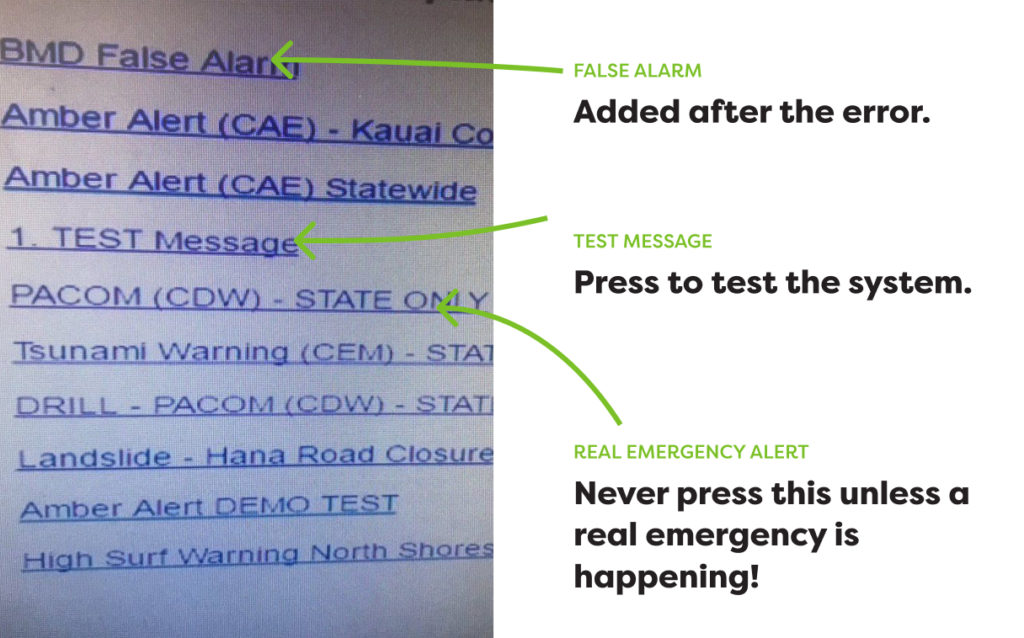
Taking a closer look at a screenshot of the assumed system, you begin to draw a clear picture of how the error happened. And may even wonder how it hasn’t happened more often. The links for the alerts are somewhat cryptic, mix hard-to-read capital letters with non-capital letters, have no consistent system for naming, and lack an overall hierarchy of importance. It’s concerning that “1. TEST Message” (presumably a test) is directly above “PACOM (CDW) – STATE ONLY”, which is what triggered the ballistic missile threat alert in the first place (according to sources).
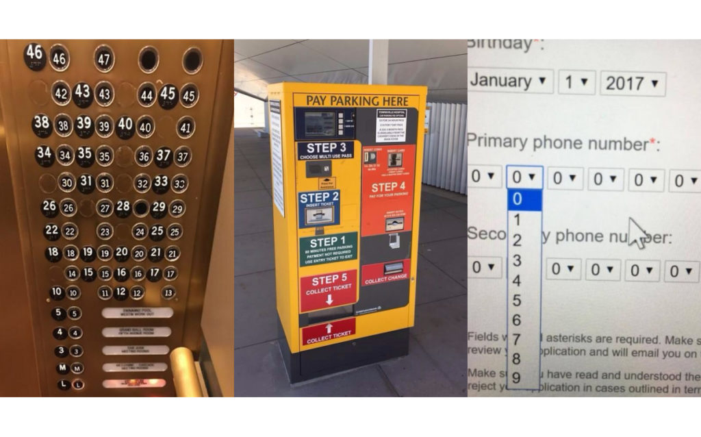
Whether we know it or not our world is full of poorly designed technologies. We only have to look around to begin to see, the elevator and all its buttons, the parking pass boxes in lots, doors, bathrooms, and yes, even our technology systems. As a business, we build or buy a software product to make our business run more efficiently, to speed up processes, and yet many times there are quirks in the system. We learn how to overlook them, yet rarely realize those are the exact design features causing the issue in the first place. Not all software products save lives or prevent massive hysteria, but if we think about it, our software is how people get stuff done. It’s the work they do or how they do their work more efficiently.
It took 38 minutes to cancel the emergency alert. And took 4 years to again take a hard look at an overhaul of the Emergency Alert Systems in Hawaii. Don’t put off fixing the big issues — they may be costing your business more than you realize.